Business cards are an essential element in your business, as 72% of people judge a company or a person by the quality of their business cards. Furthermore, 39% of them prefer not to do business with someone whose business cards look cheap.

In this context, high-quality materials and an appealing design can help you gain trust with potential clients and bring in new business opportunities. Investing in new business cards to stay in line with the new trends become a must for every entrepreneur who wants to stay ahead of competitors.
See these six business card trends that can help you improve your networking in 2018.
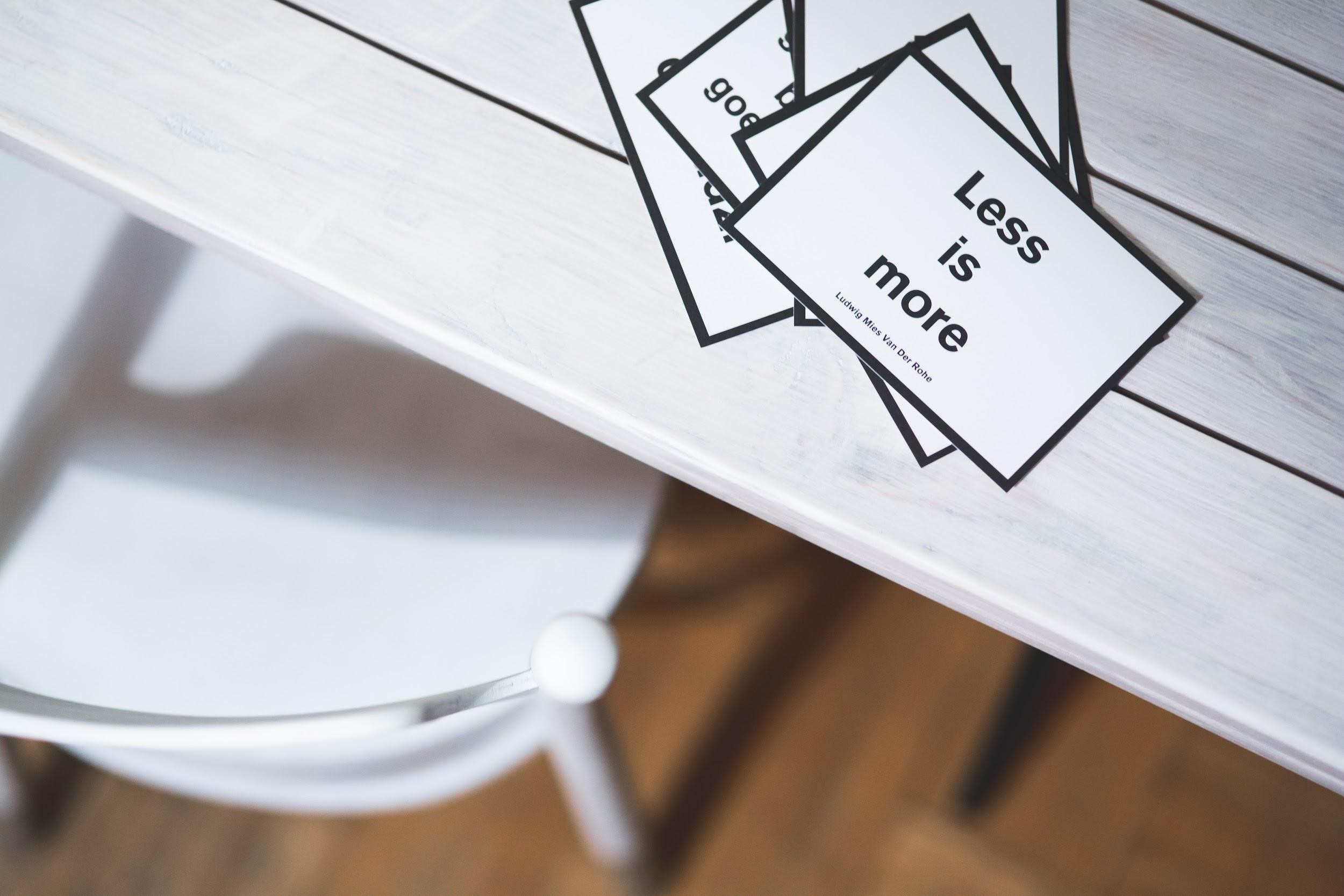
Minimal Design
It’s clean and straight to the point, being focused on functionality and user interaction. There’s no clear recipe when it comes to minimalism, but you should focus on keeping the essential elements only.
Here are some characteristics of minimal business cards:
- Space between various elements;
- No excessive decorations;
- Simple shapes;
- A limited number of colors or multiple shades of one color;
- Simple fonts for text.

Minimal design says more about you that you can even imagine. A business card built on the principles of minimalism tells that you’re a detail-oriented person, who knows how to prioritize and organize. Better than that, a minimalistic design approach expresses professionalism, leaving a good first impression on your potential business partners.
Die-cut Design
If you’re looking to step out of the crowd and shift from a rectangular business card to an original approach, you can try die-cut shapes. Used wisely, they express the essence of your brand using an innovative design.
You can experiment with various shapes and patterns, depending on your industry. From rounded corners to complex shapes, you should choose the design that reflects your personality and stays in line with your brand.
The main challenge consists in finding the right balance between modern and classic. A custom-made shape can be an interesting method to make yourself noticed if you set clear limits. For example, you don’t have to order flower-shaped business cards if you’re a floral designer to make a point.
Die-cut design should be minimalistic to create positive reactions. You can experiment with clear shapes. Many entrepreneurs find square business cards to be the winning alternative to the rectangular shape – refined and practical, they say you’re different from your competitors, without crying out for attention.
Colored Edges
78% of people consider colored business cards more interesting than plain white cards. However, too much color has been out of business for some years now. In 2018, there’s no room for experimenting with gradients or contrasts.
A good method to have both color and minimal design is by coloring edges. It’s hard to believe, but that small dash of color adds the energy your business card needs to speak for itself. Plus, it expresses creativity and makes people want to keep it – which is exactly what you need, right?
Colored edges go hand in hand with thicker cardstock paper, which is another must this year. Choose a strong color that stays in line with your brand, not to create confusion among potential clients.
Bold Typeface
Your brand’s name or logo covering an entire side of the business card is a double-edged sword. If you pick the winning design, you have an elegant and strong method to put yourself on top of your competitors. Nothing says ‘I’m a leader and an authority in my niche’ like a bold typeface.
Being a trendy element, many companies and entrepreneurs choose this design to make the most of their business cards. Which means you must come up with an innovative concept to make your business card memorable.

Bold typeface works best when you keep a minimal design. Furthermore, colors and fonts should stay in line with all your other marketing materials – brochures, flyers, or presentation folders.
Branding Elements
Everything that defines your brand should be on your business card. Your logo, your colors, and your values must be reflected in that small piece of cardstock paper.
That’s why it’s essential to use the same design for all your printings and website. Make sure your business card includes the elements that make your brand unique – similar fonts, the same colors, related visuals.
This way, you don’t create confusion. When people associate you with more than one concept, it’s hard for them to remember who you are, what you do, and what makes you different from your competitors. To avoid that, include branding elements in your business card, to become hard to forget.
Smart Business Cards
Whether you go for electronic business cards or include smart elements on your traditional business cards, using modern elements says that you’re familiar with the latest technologies. And that you use them to provide the best products and services to your clients.

With as much as 88% of business cards having a lifespan under a week, you need to come up with creative solutions to make yourself notable from your competitors. An elegant business card helps you boost your presence for more efficient networking.
You only have one shot to create a first impression. It’s not going to happen if you use cheap materials or outdated concepts to design your business cards. Find a modern idea and tailor it to fit your brand. Investing time and resources in high-quality business cards will pay off in the long run.


